
Guide to next season’s fashion colour
Featured
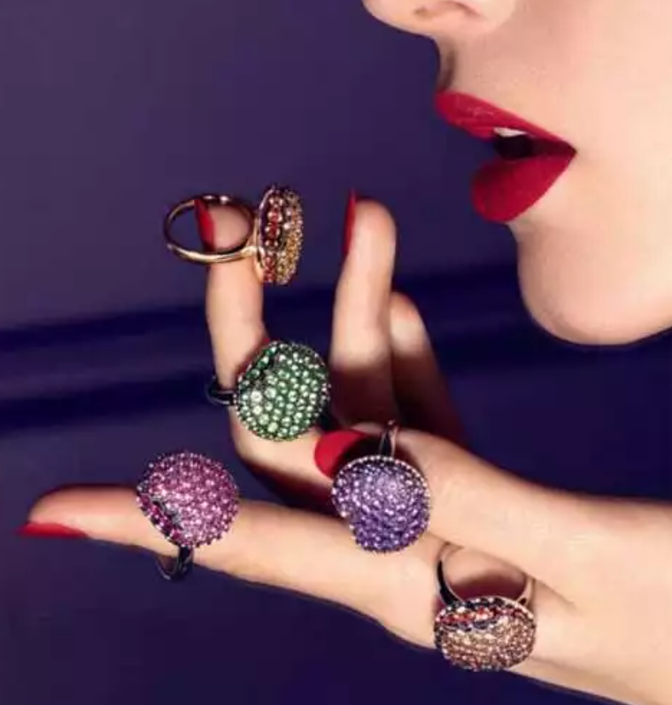
Pantone, the company recognised globally as an authority on colour standards for the design industry, has released its regular next season’s colour palette which could provide a valuable insight into 2013 consumer jewellery trends.
Released on the first day of New York Fashion Week, the Pantone Fashion Color Report features the top 10 colors for women's and men's fashion for the North America spring 2013.
As background, each season, Pantone surveys the designers of New York Fashion Week and beyond to collect feedback on prominent collection colours, colour inspiration and colour philosophy. This information is used to create the Pantone Fashion Color Report, which serves as a reference tool throughout the year for the global design community, fashion enthusiasts, reporters and retailers.
The company described the new spring 2013 palette as “soothing neutrals and energizing brights create the perfect balance for spring”.
Executive director of the Pantone Color Institute Leatrice Eiseman, who appears on the website video, said, “The expression 'balancing act' is something we all relate to as we strive to find harmony in the frantic pace of our everyday lives.
The same can be said for fashion as we look for balance between light and bright, classic and new.
“This season's color palette emphasises this need for balance, while at the same time allowing for individuality, self-expression and excitement."
Jewellery designers and jewellery retailers are always looking to stay abreast of the latest trends and fashion and Pantone’s forecast of the 2013 top colours could provide valuable inspiration.
Women's palette
According to Pantone, green is the colour of the season. The direction for spring mixes dynamic brights with novel neutrals to create a harmonious balance. This allows for unique combinations that offer practicality and versatility, but at the same time, demand attention and earn an appreciative glance.
Like the first signs of spring, Tender Shoots emulates the first signs of spring, Grayed Jade is a subtle, hushed green with grey overtones; Emerald is a lively, radiant colour that inspires insight, clarity and well-being.
Added to the green hues are African Violet, Poppy Red, Nectarine, Lemon Zest, Dusk Blue, Linen and Monaco Blue.
Men's palette
Pantone’s palette for men is similar to that of the women’s colours, with its balance of neutrals and brights.
Tidal Foam is said to emulate the colour of the sea washing onto the shore; Emerald maintains its brilliant jewel tone, perfect for men's accessories; Grayed Jade, Dusk Blue, Monaco Blue, Poppy Red and Linen sit comfortably across both palettes.
Alloy, a mid-tone grey, alongside Vibrant Orange and Sunflower (no explanations necessary) complete the men’s palette.
Recommended products
-
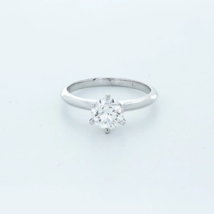
Round Diamond Ring
Capturing the joy of celebration, 1.98-carat lab-grown diamond ring sparkles wit…
0 reviews
Designer Brand Showcase Only a few left -
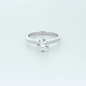
Round Diamond Ring
Reflecting the rich hues of fall, 1.42-carat lab-grown diamond ring embodies the…
0 reviews
Designer Brand Showcase Only a few left -
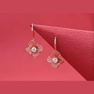
Flower Round Diamond Earring
Celebrating the renewal of spring, these earrings feature , 4.2-carat lab-grown …
0 reviews
Designer Brand Showcase Only a few left -
V Shape Round Diamond Ring
Inspired by the warmth and brightness of summer, 2.24-carat lab-grown diamond ri…
0 reviews
Designer Brand Showcase Only a few left