
Pantone’s 2014 autumn colours inspire jewellery trends
Featured
“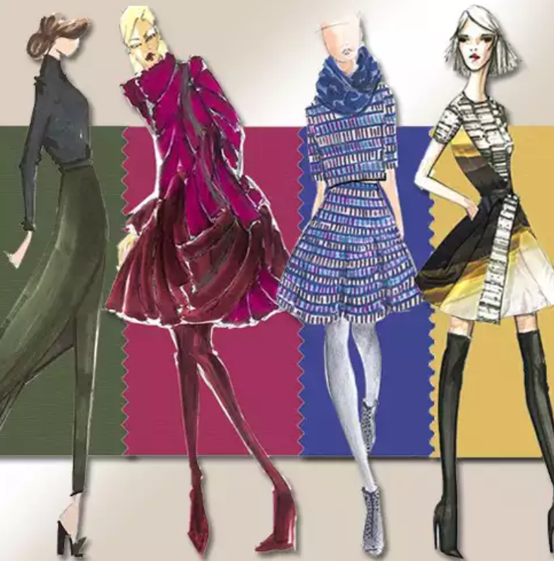 Unexpected” and “unconventional” are words that have been used to describe Pantone’s 2014 autumn colour palette – an assortment of shades expected to inspire jewellery and fashion trends for the upcoming season.
The diverse colour palette reflects the beauty and colours of the past 100 years, while also drawing on hues of the future.
Pantone maintains its authority and importance in the colour and fashion world, having once again collaborated with designers from New York Fashion Week and beyond.
Commenting on the moody tones of the upcoming season, Pantone executive director Leatrice Eiseman said, “This is a season of untypical colours—more reflective of the imagination and ingenuity, which makes for an artful collection of colours and combinations not bound by the usual hues for fall”.
Starting with a bang, Pantone introduces Sangria, an exotic red that conjures a desire to explore faraway destinations. Sangria is ignited by Aurora Red a more sophisticated shade that adds a spark to the palette.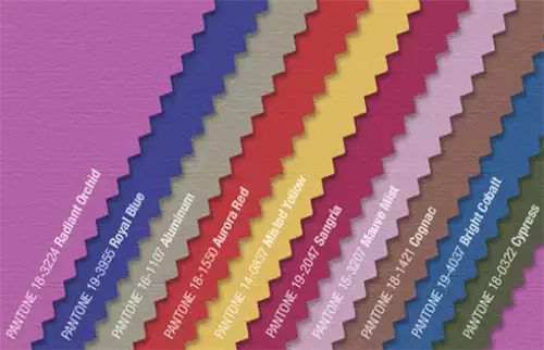
These mature reds are followed by two extremes of the purple shade that intrigue the eye and highlight femininity and empowerment. Mauve Mist is an elegant hue of purple that prompts memories of the art-deco era, while Radiant Orchid (Pantone Colour of the Year) is a playful and adaptable colour.
Cypress, a deep green, begs to be paired with either of these enchanting purples. It’s a powerful green that has a large presence on the moody spectrum.
Bright Cobalt offers a twist on the normal cobalt blue – a slightly green undertone. Alongside Royal Blue, a complex and exciting alternative to the standard navy, these two tones unify the shades of blue for the season.
Aluminum, this palette’s neutral option, presents a futuristic stainless steel shade that can be paired with Bright Cobalt, Sangria, Cypress, Royal Blue or Mauve Mist.
Cognac proposes a classy and cultured brown that is typical to autumn tones. Adding some warmth to the palette is Misted Yellow, which also points in the direction of the hotter months.
Pantone’s colour forecast provides a useful insight into the jewellery and fashion industries’ future. Why not keep up with trends and styles by incorporating this palette into your retail collections?
Below are some jewellery pieces from local brands that have already adopted Pantone’s predictions.
---Radiant Orchid
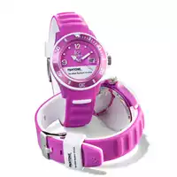
Ice-Watch
Amellee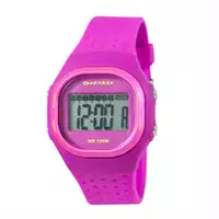
MaxumRoyal Blue
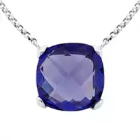
Pastiche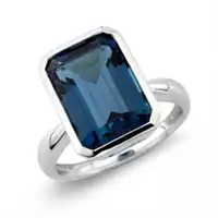
Mark Milton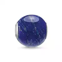
Thomas SaboAluminum
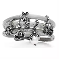
Story Jewellery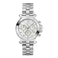
Gc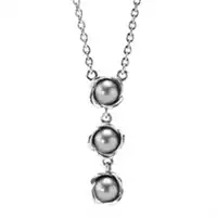
PandoraAurora Red
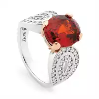
Bolton Gems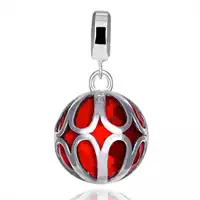
Kagi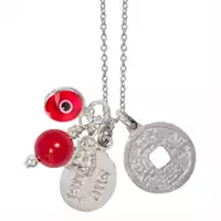
Sue SensiMisted Yellow
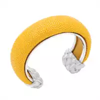
Amellee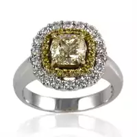
Bentley De Lisle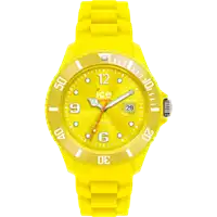
Ice-WatchSangria
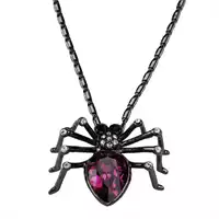
Crystalp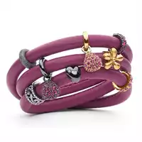
Story Jewellery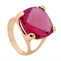
PasticheMauve Mist
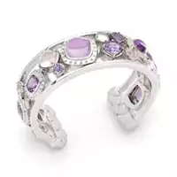
Amellee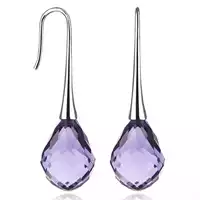
Kagi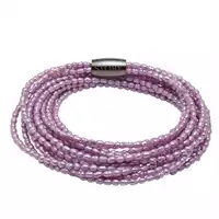
Story JewelleryCognac
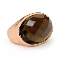
Pastiche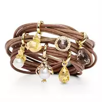
Story Jewellery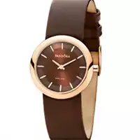
PandoraBright Cobalt
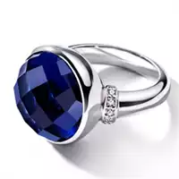
Ti Sento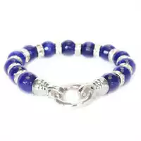
Kagi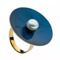
NajoCypress
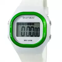
Maxum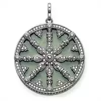
Thomas Sabo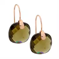
Pastiche
Recommended products
-
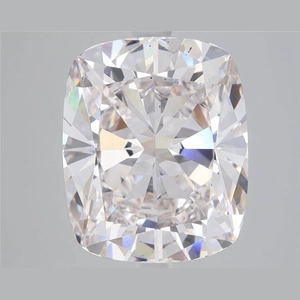
5.39 Carat Cushion Lab Diamond
About Ebooom:Discover the brilliance of lab-grown diamonds, a perfect blend of l…
0 reviews
Loose Diamond & White Diamond -
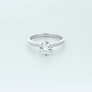
Round Diamond Ring
Reflecting the rich hues of fall, 1.42-carat lab-grown diamond ring embodies the…
0 reviews
Designer Brand Showcase Only a few left -
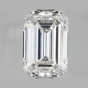
2.01 Carat Emerald Lab Diamond
About Ebooom:Discover the brilliance of lab-grown diamonds, a perfect blend of l…
0 reviews
Loose Diamond & White Diamond -
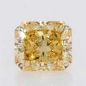
1.085 carat Clarity: VS Size: 5.59 * 5.56 * 3.92
This colorful yellow princess diamond is like the mature beauty that blooms in a…
0 reviews
Yellow Diamond